Heritage Bank
Brand Identity, Logo Refresh, Collateral
Overview
Heritage Bank is a locally owned, locally operated community bank with 19 branches located across five Northern Kentucky counties and Greater Cincinnati. They offer all of the services and products that the bigger, corporate-owned banks do, but they deliver each with a personal touch and care that the behemoths just can’t (or won’t) go the extra mile to furnish; all of this with a vow to always remain independent, and community driven.


The Challenge
The bank hadn’t really changed the way it communicated its brand message since they began doing business in 1990. With new branches opening every year, and with a goal to open locations on “the other side of the river” (they established their first Greater Cincinnati location when they opened in Mason, OH in 2018) a robust marketing strategy and communication plan was needed in order to bring them current and keep them competitive.


Research
Since Heritage had already established itself within the communities it served and had earned its equity throughout the region as a strong community bank in every sense of the term, our research was more of a fact finding mission. We wanted to discover what it was about this particular bank that drew its customers to it and earned their loyalty. What we found was that people banked with Heritage because of the individual attention that was paid to each customer. If a product or financial solution needed to be tailored to a particular individual or situation, Heritage bankers went out of their way to make that happen. Customers were treated as people, not account numbers or deposit amounts. Heritage is true community banking, first.
Strategy
Along with the individual attention and care customers experienced when banking with Heritage, we also liked the idea that every demographic there is experiencing some form of growth. Growth in savings for retirement or college tuition; for that first car or new home. Growing physically, too; there are adults with accounts they’ve had since they were kids.
Our approach was straightforward then; take this theme of the bank being there through all incarnations of “growth” and pair it with what exactly true community banking is and what it means to the people and communities served through a distinct visual representation and messaging.


The Solution
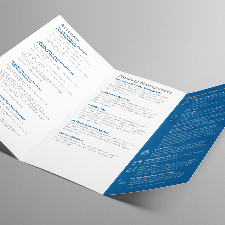
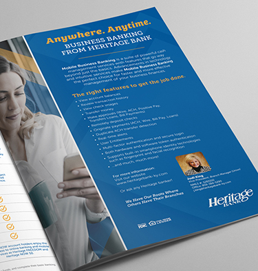
We matched a brand design that conveyed everyday life experiences with a subtle symbolic sense of financial security and support. A transparent blue and yellow diamond shape was developed to symbolize growth and upward mobility. It was placed behind vibrant, realistic imagery whose subjects represented people from all walks of life in settings familiar to Heritage customers; old, new, and future. Paired with a “Grow With Us” messaging, we launched a campaign that encouraged the public to trust Heritage, their true community bank, to help them grow their businesses, dreams, and futures via print, digital, and social media.

The Results
Through consistent verbal and visual messaging, we’ve been able to separate Heritage from other banks, both community and corporate owned, as the true choice when it comes to trusting an institution with the types of services they offer, the integrity with which they perform those services, and the values that they lead with. We continue to support a strong, cohesive marketing presence in the region through print, digital, and social media.
