Holy Spirit Child Development Center
BRAND IDENTITY, COLLATERAL, PROMOTIONAL PRODUCTS
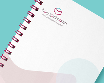
The Think Shop designed a new logo mark and graphic system for Holy Spirit Child Development Center is that would represent the center’s mission of emphasizing a positive, creative, learning environment wherein the physical, emotional, social, intellectual, moral and spiritual development of each child is nurtured. The new logo creates visual life for a group that nurtures life by using a powerful minimalist design to convey abstract notions of learning development and education for a brighter future.


GRAPHIC SYSTEM
Both our graphic system and our color palette were chosen to represent those we serve and care for every day; our children.
The primary colors are richly saturated while being offset by a light teal blue. The accent of the teal blue always appears on the top portion of the graphic, representing the guiding light of Christian values. The earthy maroons provide a mature strength to the logo while representing the human factor being inspired by the Catholic faith.
Together, this color palette reinforces our mission to develop the natural potential of each student, educate them in the Catholic faith and instill a moral compass.
The shape language plays off of core shapes in the logo’s icon and utilizes softer, lighter tones that compliment the logo with simple geometric shapes. These shapes are layered together to metaphorically represent the building of knowledge and education with our students.