VonLehman CPA & Advisory Firm
BRAND IDENTITY REDESIGN, COLLATERAL, PROMOTIONAL PRODUCTS
Overview
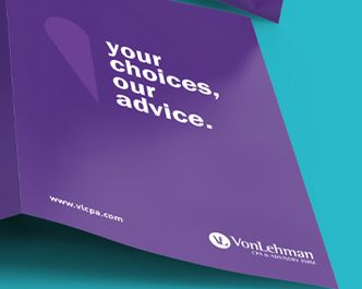
The Think Shop worked with VonLehman in refreshing the support activation of their brand. They wanted to update both the brand and the message behind it. The VonLehman culture is modern and progressive with advanced technology to aid in their capabilities. That paired with their laid back work environment were the cornerstones on which we build their brand personality. Through our process we developed the new tagline “Your Choices, Our Advice”, created a brand support system, and updated the overall vision for VonLehman.

The Challenge
The Think Shop worked with VonLehman in refreshing the support activation of their brand. They wanted to update not only the look of the brand support but the message behind it. Through our brand audit we found that their tagline, “Forward Thinking”, was general and did not truly reflect on their capabilities as a CPA firm. The photography of open, empty landscapes felt disconnected and barron and the graphic system which used silhouettes of random business people conveyed a somewhat uninspiring message and left VonLehman faceless to its customers. Besides the purple, the color pallette was limited and lacked impact in support of their logo. The serif typography they were using also gave the brand a dated, stale feel. Overall, the support elements and visuals did not connect with who VonLehman is, how they connect with their clients and where they were progressing to

Research
For us to truly understand VonLehman, who they are, their needs and where they see their company and brand progressing to we held a “discovery session” with 15-20 key employees to pull as much information from the source as possible. In this discovery session we learned in-depth about who VonLehman is, their mission, values, vision and overall what sets them aside from their competition in the marketplace. Through this “discovery session” we learned that the employees have a truly close connection with their clients. They are a modern, progressive firm with advanced technology to aid in their capabilities. Their positive, laid back work environment makes for a strong company culture. Ultimately, they needed their brand to convey these ideals.

Strategy
It was time for us to take all of this information and start to bridge the gap between their company and brand. Our team of creatives met and digested the information provided. Through word webs and ideation we visually begin to bring the brand to life through mood boards. Colors, typography, texture, patterns, iconography, photography and more are all explored and refined to build the focus of the brand message and ultimately discover who they are and where they are going. Working closely with the client and their marketing team, we narrowed down the visuals to convey the best version of VonLehman. We then move into sketches and develop the new visual support system and message internally to present 3 solutions.

Solution
Through our process we developed a new tagline, brand support system and overall vision for VonLehman. The tagline “Your Choices, Our Advice.” embodied the core of VonLehman’s business philosophy into a simple yet effect message, directly communicating with their customers. The brand support system was built on the literal connection between the V and the L in the VonLehman logo. This icon became known as the “service shape” and was used visually as a symbol to communicate core competencies of VonLehman’s business. Pinpointing changes in regulations and the industry, instructing clients in their findings to make informed financial decisions based on their unique goals and clear, concise communication are all visually conveyed with the “service shape”. Combined with a more modern, san serif typeface, a vibrant color pallette and interwoven with photography that reflects the positive work culture VonLehman has, the graphic system formed a unique message to directly correlate to the connection VonLehman has with its employees and customers.

GRAPHIC SYSTEM
ORIENTATION AND COLORS
Pulled from the joining of the Y and the L in VonLehman’s logo, the service shape symbolizes the partnership between VonLehman and the client.


PINPOINTING

INSTRUCTION

COMMUNICATION
Results
VonLehman is now equipped with a clear message and visual tools they need to maintain the equity established with their logo identity, effectively communicate their brand and set them apart from their competitors. The new brand launch was well received and resonated with the employees and their company culture